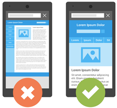
With so many Mobile Products in market where each smartphone or tablet has a different Screen size, it is important that we select some Content Specific Breakpoints so that your blogspot page may adjust and fit perfectly to the different screen sizes and may not looked squeezed or poor in resolution. Google rolled out a Mobile Friendly update on April 21, 2015, which boosts the ranking of mobile-friendly sites on mobile search results. Google no longer favors fixed width layouts and recommends that all sites must be made fluid and responsive, where text should be readable without tapping or zooming, tap targets are spaced appropriately and the page avoids unplayable content or horizontal scrolling.
Therefore follow this interesting tutorial series in order to make sure you keep receiving traffic to your blogspot blogs from mobile phones and receive a Mobile-Friendly Label from Google.
What are Breakpoints?
Breakpoints are points at which your layout design breaks or crashes. Breakpoints are CSS3 Media Queries that tells the browser which Layout to load for your website based on the screen size (viewport). It controls the display of your user interface (UI) on mobile devices.
Suppose your Navigation Menu may look fine on a Laptop or Tablet but it may look broken, horizontally scrolling the page on a small hand phone set containing a width less than 480px. The Menu tabs may look misaligned or out of position. This is the time when you will need to specify a different custom Layout using CSS styles for your menu for the breakpoint 480px so that your menu may look just fine on small screen sizes. The browser will load that Menu styles (layout) only when the screen size of the device is less than 480px.
Done with theory now lets start converting your Blogspot template into a Responsive Template!
Disable Blogger Default Mobile Template
Since we are designing a custom responsive template for your blog therefore we don't need the Default Mobile View templates offered by blogger. It is important to disable it else you will not be able to see the custom mobile changes we will make in this tutorial series.
1 Go To Blogger > Template
2 Click the Gear Icon
3 Choose "No, Show desktop template on mobile devices"
4 Click Save
5 Next Click Edit HTML and search for this code if in case it exists in your template else ignore this step and follow step#6.
[code]<b:if cond='data:blog.isMobile'> <meta content='width=device-width,initial-scale=1.0,minimum-scale=1.0,maximum-scale=1.0' name='viewport'/> <b:else/> <meta content='width=1100' name='viewport'/> </b:if>
[/code]Delete the code above if you found it.
6 Paste the following meta viewport code just below <head>
[code]<meta content='width=device-width, initial-scale=1, maximum-scale=1' name='viewport'/>
[/code]The code above gives information to the web browser about the screen size of the mobile device.
7 Save your template
Mobile Friendly Breakpoints For Blogspot blogs
Choosing the right breakpoints for any platform is the most complex task but it can be made quite easy if you apply the rule of KISS to it i.e. Keep it Simple Stupid!
We have defined below some of the most common Content Specific Device Breakpoints for blogspot blogs which respond quickly to changes in viewport. We will term it as the Responsive Cheat Sheet.
Note that we have used CSS3 Media Queries by Keeping Apple Devices as standard for simplicity but the breakpoints below cover all major brands like Samsung, Black berry, Nokia, Windows Phone, Kindle, Nexus and so on.
1 Go To Blogger > Template > Backup your template
2 Click Edit HTML
3 Search for ]]></b:skin> and paste the following CSS Code just below it:
[code]<style>
/* ######## Responsive Cheat Sheet ########### */
/*-----iPhone 2G, 3G, 4, 4S Portrait View ZONE1 ----------*/
@media only screen and (max-width:320px) {
}
/*-----iPhone 2G, 3G, 4, 4S Landscape View ZONE2 ----------*/
@media only screen and (max-width:480px) {
}
/*-----iPhone 5,6 ZONE3 ----------*/
@media only screen and (max-width:568px) {
}
/*-----iPads, Tablets ZONE4 ----------*/
@media only screen and (max-width:768px) {
}
</style>
[/code]4 Save your template and you are almost done!
The above are the only breakpoints required to make any blogger template responsive. You don't need combined or separate breakpoints for landscape and portrait view. The above Cheat Sheet is enough to make everything work just fine!
How these breakpoints work?
The yellow highlighted regions above are viewport sizes that defines the CSS Styles for a particular screen size. The CSS styles for each screen size will be defined inside these viewports.
By max-width:480px we mean width less than or equal to 480px. Styles inside this breakpoint will load only when the screen size is less than or equal to 480px.
For example If you wish the Sidebar Column which has a CSS Class .sidebar and width 300px, to have a 100% width in a Mobile Phone then you will add its new width inside ZONE1 breakpoint (inside the curly braces) as shown below
[code]/*-----iPhone 2G, 3G, 4, 4S Portrait View ZONE1 ----------*/
@media only screen and (max-width:320px) {
.sidebar {width:100%; overflow:hidden;}
}
[/code]That simple!
Note that none of the codes above will make your blog mobile friendly yet. The above guide is the skeleton/basic structure for a responsive layout. Your blog template will be fluid once you cover and follow all parts of this tutorial series.
Need Help?
Let us know if you need further clarification on any concept. I would love to answer all your questions posted in the comment form below. A lot more interesting parts are on its way. In our coming tutorials we will learn in detail how to insert the new responsive styles correctly inside the breakpoints specified above for different components/widgets of your blog. Make sure to Subscribe to our Email newsletter to ensure you don't miss any update.
Peace and blessings buddies! =)


0 comments:
Post a Comment