Why do you need Mobile Friendly Images?
Your blog is being increasingly viewed on smaller, slower, low bandwidth devices. On Such small screen devices your desktop-centric images will load really slowly, which can cause UI lag, and cost you and your visitors un-necessary bandwidth and money.
Therefore responsive images is the only solution to fast load speed and better SEO ranking of your blog.
Image Size differ For Different Pages
Images are used all over your blog. Inside header, footer, sidebar and mostly inside your Post content. You may wish to display small thumbnail images on your homepage posts list but you would choose to display a large image when the post page is viewed. Thus image sizes may differ for different types of pages.
On Homepage: Index Page
On Post Page : Item page
In order to achieve this we will make use of both @Media queries and Conditional Tags to better control image appearance of our UI.
The images in Header and Post content are often wider in size compared to images in footer and sidebar. So we will style the images accordingly.
Find Parent ID's or Classes
I have written a detailed tutorial that you can read to learn how to find what is the parent class or parent ID of any HTML element on your webpage using browser inspection method.
- Read: Use Chrome Inspect Tool
In our case the parent classes or IDs are as follow:
- The Header widgets have classes - .headerright and .headerleft
- The Sidebar Column has ID (Same for you) - #sidebar .widget-content
- The Footer has ID - #lowerbar-wrapper
- The Post has the following class (Same for you) - .post
Since we are styling images and we know that all images have the <img> tag therefore we will append img class next to all the above IDs and classes and for images which are hyperlinked we will use the class a img.
Select Device Breakpoints
Now you just need to add the following CSS codes in their respective breakpoints using the CSS Responsive Cheat Sheet (Refer Part#2) . We will choose the 786px breakpoint which is ZONE4 . You will add the following CSS code inside this zone as shown below:
[code]/*-----iPads, Tablets ZONE4 ----------*/
@media only screen and (max-width:768px) {
.headerright a img,.headerleft a img{
max-width: 75%!important;
margin-left: 0;
position: absolute; height:auto;
left: 30px;}
.post a img, .post img{max-width:95%; height:auto;}
#sidebar .widget-content a img , #sidebar .widget-content img { max-width:98%; height:auto;}
#lowerbar-wrapper a img , #lowerbar-wrapper img { max-width:98%; height:auto;}
}
[/code]Importance of max-width:
A max-width property of 98% will ensure that your image width may not exceed 98% of to parent container width. Never keep this property equal to 100% else the images will overlap the parent container.
In short your image will be neatly displayed on screen, no matter how big or small it be.
Display different sized images on Homepage and Posts
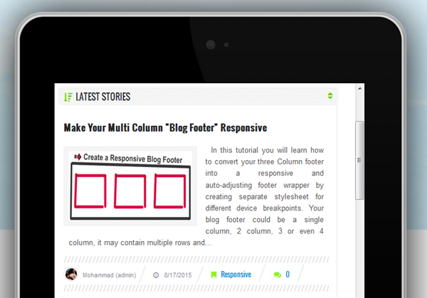
If you want to display thumbnails on homepage and larger images on post page or if you wish to float images to left on homepage but display them center aligned on post page then you can make use of the conditional tags and enclose the media queries inside it as shown below:
You will need to add this code just below ]]></b:skin>
HOMEPAGE IMAGES or Thumbnails:
<b:if cond='data:blog.pageType == "index"'>
<style>
/*-----iPhone 2G, 3G, 4, 4S Landscape View ZONE2 ----------*/
@media only screen and (max-width:480px) {.post a img, .post img {width:95%; float:none; height:auto; clear:both; margin-bottom:10px;}
}
/*-----iPads, Tablets ZONE4 ----------*/
@media only screen and (max-width:786px) {
.post a img, .post img {max-width:50%; height:auto; float:left; margin: 0px 10px 10px 0px;}
}
</style>
</b:if>
In the above code:
- the first breakpoint (480px) will give your homepage post images a 95% width and center alignment in small smartphones having width less than 480px.
Result on 480px screen - Homepage:
- the second breakpoint (786px) will float your images to left of text and give it 50% max width on homepage.
Result on 786 screen - Homepage:
POST IMAGES:
Now for Images inside Posts you can use the following breakpoint code that we already shared earlier
[code]/*-----iPads, Tablets ZONE4 ----------*/
@media only screen and (max-width:768px) {
.post a img, .post img{max-width:95%; height:auto;}
}
[/code]- The code above will center align your images and give it 95% of maximum screen width
Result: Image on Post pages
You can do wonders with these conditional tags and customize your blogs for mobile devices the best you can! =)
Need Help?
You will never be able to succeed with responsive designs unless you remove confusions by asking us questions. Post your questions below and I would love to help you with all your queries. I hope this series may help you better understand some complex web designing terminologies and techniques. Wishing you guys the best of blogging and life! =)


0 comments:
Post a Comment